There has been much discussion of a paper by Marcott et al, which is a proxy temperature reconstruction of low resolution proxies going back to 11300 BP. They are distinguished by not requiring calibration relative to measured temperatures.
There has been discussion in make places, but specially at CA and WUWT, where it isn't popular. Steve McIntyre at CA has done a similar emulation.
The complaints are mainly about some recent spikes. My main criticism of the paper so far is that they do plot data in recent times with few proxies to back it. It shows a "hockey stick" which naturally causes excitement. I think they shouldn't do this - the effect is fragile, and unnecessary. Over the last century we have good thermometer records and don't need proxy reinforcement. Indeed the spikes shown are not in accord with the thermometer record, and I doubt if anyone thinks they are real.
Anyway, I thought I would try for a highly simplified recon to see if the main effects could be emulated. R code is provided.
Update I have posted an active viewer for the individual proxies.
Update - I've done another recon using the revised Marcott dating - see below. It makes a big difference at the recent end, but not much elsewhere.
Further update - I've found why the big spike is introduced. See next post.
Data
The data is an XL spreadsheet. It is in a modern format which the R utility doesn't seem to read, so I saved it, read it in to OpenOffice, and saved it in an older format. There are 73 sheets for the various proxies, over varying time intervals. The paper and SM have details. I'm just using the "published dates" and temperatures. The second sheet has the lat/lon information.Marcott et al do all kinds of wizardry (I don't know if they are wizards); I'm going to cut lots of corners. Their basic "stack" is a 5x5 degree grid; I could probably start without the weighting, but I've done it. But then I just linearly interpolate the data to put it onto regular 20-year intervals strating at 1940 (going back). They also use this spacing.
Weighting
The trickiest step is weighting. I have to count how many proxies are in each cell at any one time, and down-weight where there are more than one per cell. The Agassiz/Renland was a special issue with two locations; I just used the first lat/lon.After that, the recon is just the weighted average.
Update - I should note that I am not using strict area weighting, in that I don't account for the reduced area of high latitude cells. I thought it was unreasonable to do so because of the sparsity. An Arctic proxy alone in a cell is likely to be surrounded by empty cells, as are proxies elsewhere, and so downweighting it by its cell area just has the effect of downweighting high latitudes for no good reason. I only downweighted where multiple proxies share a cell. That is slightly favorable to Arctic, since theoretically they can be closer without triggering this downweight. However, in practice that is minor, whereas the alternative of strict area weighting is a real issue.
Graphics
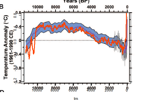
I made a png file with a transparent background, and pasted it over the Marcott Fig 1B, which is the 5x5 recon over 11300 years. There was a lot of trial and error to get them to match. I kept both axes and labels so I could check alignment.I'll probably add some more plots at shorter scales. The fiddly alignment takes time.
The plot
Mine is the orange curve overwriting their central curve and blue CI's.
Discussion
The most noticeable think is that I get a late rise but not a spike. Again I'm not doing the re-dating etc that they do.Another interesting effect is that the LIA dips deeper earlier, at about 500 BP, and then gradually recovers, while M et al get the minimum late.
Overall, there is much less smoothing, which is probably undesirable, given the dating uncertainty of the proxies. There is a big dip just after 10k BP, and a few smaller ones.
Aside from that, it tracks pretty well.
Re-dating
Update:I ran the code again using the revised dating put forward by Marcott et al. It's mostly Marine09, but not always. It doesn't make much difference to the curve overall, but does make a big difference at the recent end. Here is the revised overlay plot:
And here are the orange plots shown separately, published dates left, revised dates right:
 |  |
I'll look into the difference and post again.
The code
There is a zip file with this code, the spreadsheet in suitable format, and other input files here. I've done some minor editing for format to the spreadsheet, which may help.Update - Carrick reported that Mac users can't use the xlsRead utility. I've modified the code so that it immediately writes the input to a R binary file, which I have put (prox.sav) in the zip file. So if you have this in the directory, you can just set getxls=F below.
#setwd("C:/mine/blog/bloggers/Id")

# A program written by Nick Stokes www.moyhu.blogspot.com, to emulate a 5x5 recon from

#A Reconstruction of Regional and Global Temperature for the Past 11,300 Years

# Shaun A. Marcott,  Jeremy D. Shakun,  Peter U. Clark,    and Alan C. Mix

#Science 8 March 2013: 339 (6124), 1198-1201. [DOI:10.1126/science.1228026]

#https://www.sciencemag.org/content/339/6124/1198.abstract


# Need this package:

getxls=F  # set to T if you need to read the XL file directly

if(getxls) library("xlsReadWrite")

# The spreadsheet is at this URL "https://www.sciencemag.org/content/suppl/2013/03/07/339.6124.1198.DC1/Marcott.SM.database.S1.xlsx"

# Unfortunately it can't be downloaded and used directly because the R package can't read the format. You need to open it in Excel or OpenOffice and save in an older format.


loc="Marcott.SM.database.S1.xls"

prox=list()

# Read the lat/lon data

if(getxls){

lat=read.xls(loc,sheet=2,from=2,naStrings="NaN",colClasses="numeric")[2:77,5:6]

}  else load("prox.sav") # If the XL file has already been read

o=is.na(lat[,1])

lat=as.matrix(lat[!o,])

w=rep(0,36*72)

wu=1:73; k=1;

for(i in 1:73){

j=lat[i,]%/%5;

j=j[1]+j[2]*36+1297;

if(w[j]==0){w[j]=k;k=k+1;}

wu[i]=w[j];

}

# Read and linearly interpolate data in 20 yr intervals (from 1940)

m=11300/20

tm=1:m*20-10

g=list()

h=NULL

if(getxls){

for(i in 1:73){

prox[[i]]=read.xls(loc,sheet=i+4,from=2,naStrings="NaN",colClasses="numeric")[,5:6]

}

save(prox,lat,file="prox.sav")

}


for(i in 1:73){

u=prox[[i]]

g[[i]]=approx(u[[1]],u[[2]],xout=tm) # R's linear int

y=g[[i]]$y

y=y-mean(y[-25:25+250]) # anomaly to 4500-5500 BR # period changed from 5800-6200

h=cbind(h,y)

}

r=NULL  #  Will be the recon

# now the tricky 5x5 weighting - different for each time step

for(i in 1:nrow(h)){

o=!is.na(h[i,])  # marks the data this year

g=h[i,o];

u=wu[o]; n=match(u,u); a=table(n); d=as.numeric(names(a));

e=u;e[d]=a;wt=1/e[n]; #wt=weights

r=c(r,sum(g*wt)/sum(wt))

}

# Now standardize to 1961-90, but via using M et al value = -0.04 at 1950 BP

r=r-r[98]-0.04

# now tricky graphics. my.png is the recon. ma.png is cut from fig 1b of the paper. You have to cut it exactly as shown to get the alignment right

png("myrecon.png",width=450,height=370)

par(bg="#ffffff00")  # The transparent background

par(mar=c(5.5,5,2.5,0.5))  # changed to better align y-axis

plot(tm,r,type="l",xlim=c(11300,0),ylim=c(-1.2,0.8),col="#ff4400",lwd=3,yaxp=c(-1.2,0.8,5))

dev.off()

# Now an ImageMagick command to superpose the pngs

# You can skip this if you don't have IM (but you should)

system("composite myrecon.png ma.png recons.png")


"Over the last century we have good thermometer records and don't need proxy reinforcement."
ReplyDeleteMake that the last *three* centuries:
http://s7.postimage.org/trx62nkob/2agnous.gif
Nik,
DeleteYes, certainly more than 150 yrs, anyway. But there's a lot of pointless argument about 20C proxy aberrations, when no-one seriously believes they should be preferred to the thermometer record.
This is the same crap as the EIKE paper Zorita smuggled into Climate of the Past. The really old instrumental series have a well known warming bias for early years because the thermometers were not sheltered. BEST appears to be able to correct for this (and a recent effort by Boehm handles it for a few central european stations). Links at RR.
DeleteIs there any quality test of the proxies, if they correlate at least some time with temperature ? If not, I would say the reconstruction will have, among other issues, reduced variability.
ReplyDeleteNo, the proxies don't need to be correlated with air temp observations for calibration, and many of them do not have the required overlap. Even those that do have not enough resolution for such a check to be helpful.
DeleteBut yes, it certainly has reduced variability, as they acknowledge.
Why would everyone else (last example Gergis et al) do a calibration to ensure selecion of proxies with the best temperature response ?
DeleteMarcott et al did admit reduced variablitiy due to low resolution. I did not notice any admission of reduced variability due to the possible use of poor quality proxy data, which also reduces min/max ranges.
Dating errors also disperse min/max values.
DeleteIn sum, for several reasons this reconstruction should be biased towards a straight line with low variability. Hard to see anything of use from this exercise or any insight in the true temperature range of the holocene.
Anon,
Delete"Why would everyone else (last example Gergis et al) do a calibration to ensure selecion of proxies with the best temperature response ?"
because of the nature of the proxies. For tree-rings etc, the only way to assign a temperature to the width or whatever is by calibration against observed air temp.
But Marcott et al choose proxies for which that is not required. They independently find the relation between observation and temperature. Some can be tested in lab - others by observation in different, usually marine, environments.
And yes, every source of error tends to loss of retail. They point this out early on. But they can expect to get a better picture of the long term, partly because their proxy calibration is not affected by short-term events that might influence a calibration period and be reflected back.
Thanks Nick. Your result looks similar to that provided by lance Wallace at WUWT,
ReplyDeletehttp://wattsupwiththat.com/2013/03/14/marcotts-hockey-stick-uptick-mystery-it-didnt-used-to-be-there/#comment-1248601
Although he doesn't say so, I guess he just did a straight averaging rather than area-weighting as you've done here, showing that the general picture is "Robust" :)
I have been meaning to do this myself but haven't got round to it yet.
You should try Matlab - it can read in the XL file really easily!
PaulM
Paul,
DeleteThanks for the Wallace link. It isn't clear to me whether it is from a new recon or a re-plotting of M13 results. But it's more similar to M13 than mine is.
Yes, sometimes Matlab would be handy, but I didn't have a major problem with R - in fact I didn't even notice it until I tried to make the program turnkey by reading the XL file in directly. I had been using openoffice, which only saves in the older XL formats.
ps Something odd happened here - I wrote a response to you a while ago, but it's not here now. It may turn up somewhere.
Paul,
DeleteI looked in more detail at Lance Wallace's spreadsheet. I think what he has done is to simply sort all the proxy obs anomalies by published time, and then make scatter plots with various degrees of smoothing by time over the aggregate. This tends to weight proxies according to their volume of numbers - ie if they report more frequent numbers, they get more points in the scatter plot.
Nick, when I saw your results I recognized that last 1,500 years. I overlaid my 24 proxy results (in black) on top of your results and got relatively good alignment. My weighting algorithm is different, accounting for some slight differences. In my results, I graphed only the last 1,500 years so got considerably more detail on the x axis. That uptick at the end is more a gradual recovery from the LIA starting ~450 BP. I'm not seeing that terrifying blade at the end that dwarfs the entire Holocene as Marcott depicts. There's more going on than whats in the raw proxies.
ReplyDeletehttp://img41.imageshack.us/img41/7807/recons2.gif
HankH
Hank,
DeleteYes, I think everyone is getting fairly good agreement on the bulk of the time period. The end effect definitely seems to be virtually an artefact of the small number of proxies, and of proxies dropping out in arbitrary order.
I don't know if you have the paper yet, but their Fig 3 does it more sensibly. They just show the distribution of proxy results, so these late spikes have no special status. Then they show the thermometer-measured difference over the century. They also show the effect of projections.
Hello Nick. I don't have the paper yet. Unfortunately, the paywalls I subscribe to are mostly medical journals (I'm a biostats guy). I know a few gents who I'm sure have it. I'll reach out to them.
DeleteBTW, great job on the R code. One of these days I need to sit down and get committed to it. My coding background is C#. What takes R 10 lines requires 100 lines in C#, LOL!
All my best,
HankH
STOP ALL THE PRESSES!
ReplyDeleteThus spake Chewbacca:
> Emulating a process requires using the same process. Nick Stokes didn’t even try to do much to replicate their work. Either he didn’t replicate anything, or their method has little difference from a straight average.
http://judithcurry.com/2013/03/16/open-thread-weekend-11/#comment-303310
Sorry, he was not finished!
Thus he spake again:
> Regardless, if the latest part of the reconstruction isn’t robust, that calls into question the entire reconstruction.
Sometimes, I do wonder how we could have imagined reality.
Thanks, Willard,
DeleteI've added an update and noted it over there.
"Sometimes, I do wonder how we could have imagined reality."
At University, I learnt that reality is an optical illusion caused by alcohol deficiency.
You say: "I made a png file with a transparent background, and pasted it over the Marcott Fig 1B, which is the 5x5 recon over 11300 years. There was a lot of trial and error to get them to match. I kept both axes and labels so I could check alignment."
ReplyDeleteNick, for doing this sort of thing, try the readPNG program in the PNG package. YOu can then place the png image onto your screen using rasterImage. you can set the parameters so that you can plot directly onto the png image and save the annotated image.
I've done this for some Marcott graphics and have saved the raster settings. I'll post some examples up at CA some time soon.
One way of directly reading the Marcott xls file is to use an older R issue. I had an R.11 issue on my computer and used the older xlsReadWrite and it worked fine.
Thanks,
Deletepng certainly looks like a handy package. Lots of things I could use it for.
One of my complaints with R is that it is so unwilling to tell me the pixel values of its axis endpoints (user to pixel mapping). I've worked out ways that basically involve rescaling from character sizes etc, but it's a pain. Otherwise I could just get the pixel values of the Marcott pic in paint and calculate the lineup.
Nick thanks for updating your code.
ReplyDeleteOn a related topic, it probably would have been better if Shaun Marcott had avoided making this statement:
"In 100 years, we’ve gone from the cold end of the spectrum to the warm end of the spectrum,” Marcott said. “We’ve never seen something this rapid. Even in the ice age the global temperature never changed this quickly."
The statement may or may not be right, but you certainly can't use Marcott's reconstruction to reach that conclusion.
I should have added for people who haven't been following that particular thread across the blogosphere, that the frequency resolution of the reconstruction prevents you from making a statement of this sort. I find it mildly ironic that Marcott used the word "spectrum" in a assertion that is shown untenable by looking at the spectrum of his reconstruction.
DeleteCarrick,
DeleteIndeed, his recon can't show that.
I was interested in this quote from your link:
"The same fossil-based data suggest a similar level of warming occurring in just one generation: from the 1920s to the 1940s. Actual thermometer records don’t show the rise from the 1920s to the 1940s was quite that big and Marcott said for such recent time periods it is better to use actual thermometer readings than his proxies."
That's a point that I've been making for a while. People get excited about 20C aberrations in proxies, but they shouldn't. It doesn't tell us anything about real temps; thermometers do that. It may tell us about inadequacies in the proxies, but in this case it just says there were too few of them.
I don't really understand what you referring to as to which people are getting excited about which 20C aberrations. Perhaps you could link me so I would be sure I understood your comment better?
DeleteWith the update to your post, it is looking more and more likely that the 20th century spike represents a glitch in their method (it's too high of frequency to be signal related).
Carrick,
DeleteThere are plenty of people getting excited about this spike - just see WUWT or CA. And then there was hide the decline etc.
The fact is that temperature didn't spike and didn't decline - we know that. Maybe the aberrant temps tell us something about the methods, but nothing about the climate.
As to the spike, it may be the method, but it's in my reduced version too. I think Steve Mc may be right that it's a sort of end effect when dates get moved, which is OK mid-range but at the ends there is nowhere to go. I'm trying to track the numerics here.
OK, I wasn't sure if you were talking about the spike at the end (which is more like 1°C right?) or something else. I admit I don't spend a lot of energy following WUWT.
DeleteThough oo be fair, Marcott seems (or maybe now "seemed") pretty excited about it too.
The people getting excited about the spike are:
DeleteSeth Borenstein,
"Recent heat spike unlike anything in 11,000 years"
NBC news,
"Warming fastest since dawn of civilization, study shows"
Andy Revkin etc etc
No, the excitement from Borenstein et al was based on Fig 3 in the paper which compares the distribution of proxy temperatures with two decades of instrumental; 1900-9 and 2000-9. Here's SB saying that:
Delete"The decade of 1900 to 1910 was one of the coolest in the past 11,300 years — cooler than 95 percent of the other years, the marine fossil data suggest. Yet 100 years later, the decade of 2000 to 2010 was one of the warmest, said study lead author Shaun Marcott of Oregon State University. Global thermometer records only go back to 1880, and those show the last decade was the hottest for this more recent time period."
I quoted above where Marcott said in the SB article that thermometer, not proxy, was the way to decide recent temp.
Not the blade, but the handle. If you go to google images and look for holocene temperature, you see about the same behavior, and the blade, we know, is supported by instrumental records.
ReplyDelete